The client
SKB bank, one of the oldest banks in Slovenia, has always been prone to digital innovation. It introduced its online banking service almost twenty years ago when the internet was still in its infancy.
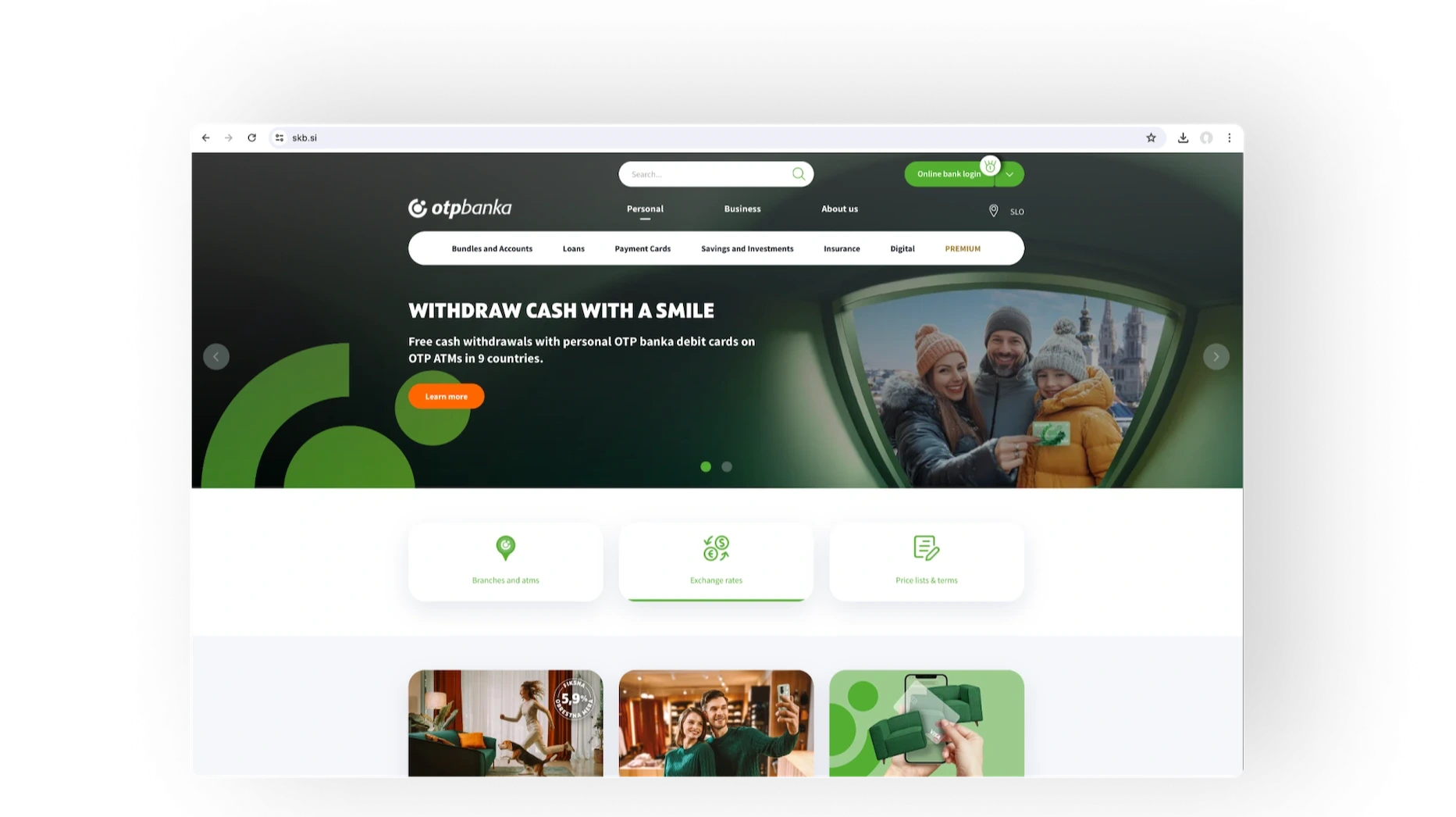
However, their website did not reflect the company's ambitions. It was outdated, neglecting some of the basic user experience principles. Burdensome page management just added to the problem. As a result, the page failed on the main KPIs. Obviously, a profound makeover was required in order to
- improve the user experience and conversions
- redefine the look and feel to better match the bank’s corporate identity
- implement a CMS that meets the bank’s editorial process
- meet the high standards of the bank's security policy
The SKB’s main KPI is the number of consultancy appointments. In important life-stage decisions that involve larger financial investments, consumers want to discuss their challenges with an experienced consultant. Needless to say, such cases also happen to be the most compelling opportunities for the bank.

The Strategy
We set out to rebuild the website in two steps. In the first phase, we will build the initial version based on our assumptions and let it run for several months to collect real user data. These inputs will help us to enter the second phase, where we will bring about the necessary enhancements and optimizations.
Starting with the discovery phase, we interviewed the bank’s representatives on business goals, users, competition, potential risks, technical environment, and constraints. In separate workshops, we developed persona profiles and their “jobs to be done.”
Considering the stage of the buyer journey, we proposed dual-option user flows to tag users’ preferences as they were moving down the funnel. Once we knew what they were after, we could employ various personalization tactics on their next visits to boost conversions.
In Creatim, we have found a partner who provides quality and dependable customer service. Above all, they can connect the dots of interrelated challenges and deliver solutions that add to our customer’s satisfaction.
Lara Berlec, Communication Director
The Solution Design
User flows
Each step in the user flow has the content structured in a way that gives the user a hint about the useful information that awaits them in the next step, thus encouraging them to explore further.
Soon the average time spent on the loan product pages increased to 1:30 minutes, indicating that the users really read the content through. Obviously, the website provided users with the right information in the right places.
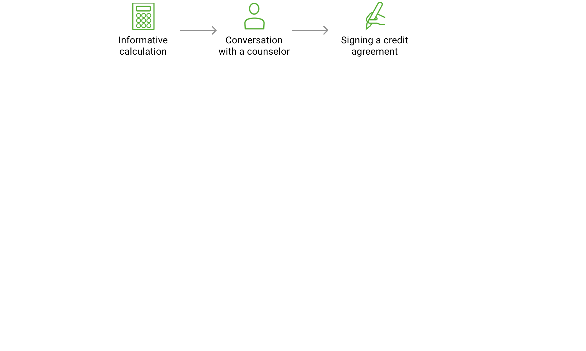
We also made it easy for users to do informative calculations and submit forms. Throughout the process, they were invited to reach for a consultant to clarify the details.
Mobile-first
Leveraging a mobile-first design approach we paid special attention to mobile forms, keeping them short and accessible to minimize the user’s effort.
Mobile users account for less than half of all visits to the SKB bank website. However, they provide more than 60 % of all conversions to the site.
Mobile users account for less than half of all visits to the SKB bank website. Considering the benchmark data, users don’t like to submit forms from small screens. However, despite being the lesser piece of the pie in terms of visits, mobile visitors provide more than 60 % of all conversions to the site. Which means we must have done something right:)
Since we have proof that mobile visitors are more valuable than desktop users, it pays to enhance the mobile experience even further.
Visual and functional consistency
We aligned the website's visual appearance with the OTB Group's corporate identity and ensured all the elements were communicated consistently across the website.
Likewise, in terms of functional consistency, all interactive elements worked similarly in all parts of the site to promote the user’s confidence and to ensure the learning curve is as gentle as possible.
Personalization
Personalization of the data flows, and marketing-related enhancements are subject to the second phase of the project, which is currently pending. But that doesn’t mean the initial version is without any bells and whistles in this regard.
For instance, after logging out of the online banking service, which is a separate application, users are automatically redirected to the homepage. Since we know that all these users are existing clients, we show them different content than what we show to first-time users who enter the homepage from other channels.
Useful tip
Analyzing the session recordings, we have found out that many first-time users simply don’t bother to close the cookie consent banner at the bottom of the page and potentially miss out on important content or a call to action hidden beneath the banner.
It is much more convenient to extend the cookie banner across the whole screen to force the user to close it in order to proceed.

Supporting the bank’s back-stage workflows
Creatim has developed its own content management system (CMS). It proved to be very handy in cases where aligning a standard off-the-shelf CMS to the specific solution requirements would impose too much effort or would result in a suboptimal solution.
The CMS comes with flexible editorial tooling that can be tailored to the editorial team’s needs. Moreover, it supports multi-tier workflows out of the box. In the case of SKB bank, a 3-tier editorial flow was required so that SKB bank’s editorial and marketing teams could collaborate effectively while complying with the strict bank’s security policy at the same time.
The CMS comes with a flexible editorial tooling that can be tailored to the editorial team’s needs. Moreover, it supports multi-tier workflows out-of-the-box.
Security and data protection
Needless to say, cybersecurity and data protection options are crucial for any bank.
The site is built on Symfony, the leading PHP framework with a strong emphasis on application security. Following the security by design principles, we have aligned the website with the high standards of the bank's security policy in terms of personal data protection, technical development, and hosting.
Immediately after the launch, the bank appointed a third-party cybersecurity company to perform a security audit and related stress tests. No major issues were discovered.
Creatim, which holds an ISO 27001 security certificate, is responsible for all website-related security and technical operations. The bank was given a single point of contact to Creatim’s technical support team, which takes care of hosting, maintenance, and development-related activities.
The results
At phase 1 of our two-phase strategy, the results were already impressive - a 10% conversion rate on loan products! The significantly extended time that users spend on the site also indicated that the users really read the content.
In the second phase, walking with the bank’s marketing team to further enhance the user experience, drive client satisfaction, and better support the related marketing initiatives, the client's form submissions have increased by 30%.

 4,6
4,6


