The client
As an electricity retailer, E3 struggled to gain a competitive advantage over its rivals. There are no geographical boundaries in the electricity business, and customers can change their provider at the drop of a hat. With such fierce competition, user experience becomes a pivotal element in brand differentiation.
Facing volatile market conditions, E3 was forced to rethink its online strategy to remain competitive and attract new customers. We asked Milos Protic, who was assigned to implement the company’s new digital user experience, to tell us more about their plans and aspirations.
Interview
Miloš, what was the main goal of E3’s website redesign?
E3’s strategy draws on green energy, which speaks to a modern, ecologically aware customer. However, we were not able to attract such customers online. These consumers are typically younger and are used to a top-notch user experience from other sites. They expect convenience and high-quality service from any company they buy from. They would quickly label you “a fossil” if you don’t follow the pace of online business.
These were the main drivers of our website redesign. Moreover, we wanted a solution that would grant us flexibility in shaping our offer and tools to inform and educate our customers.

What do you understand by “flexibility”?
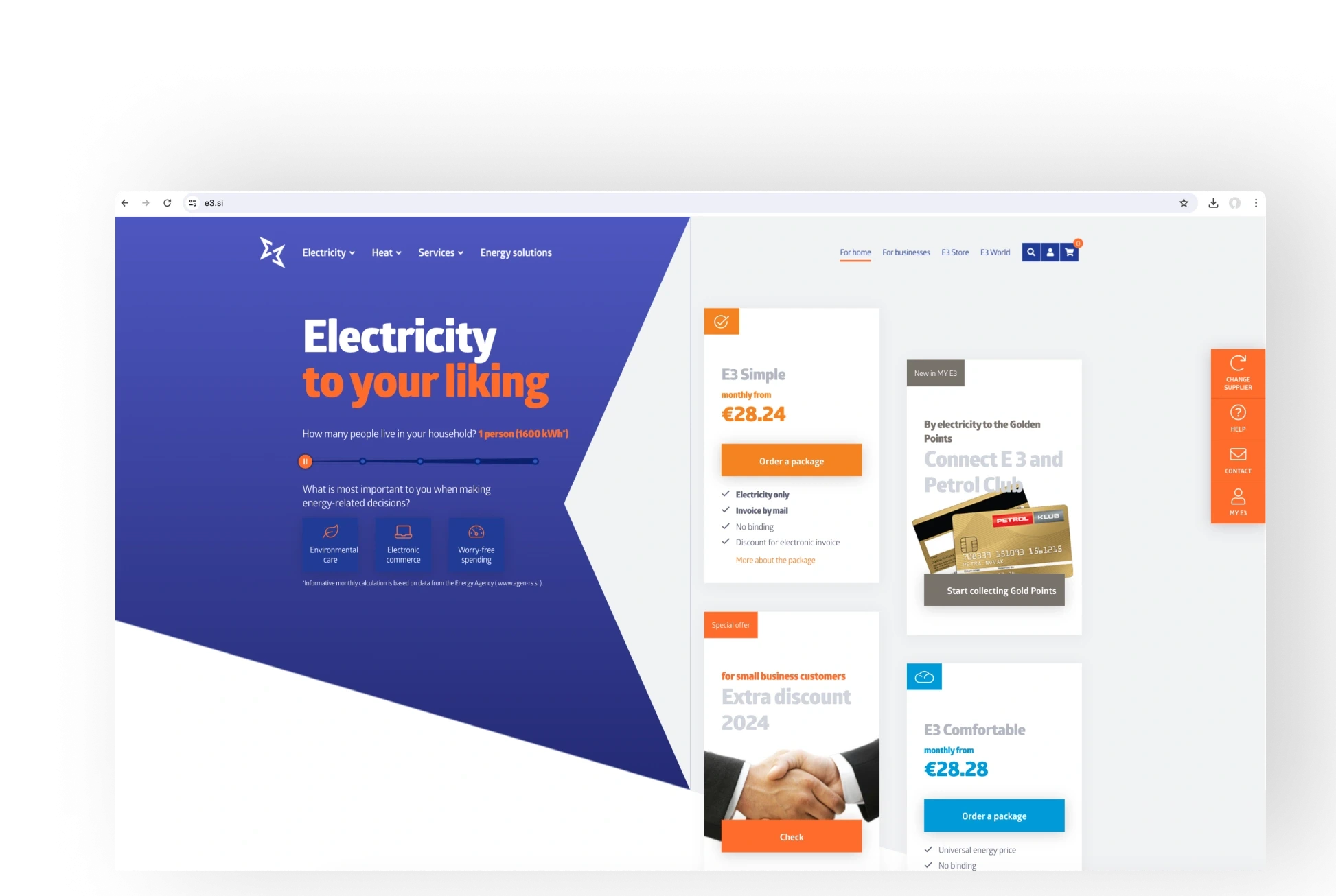
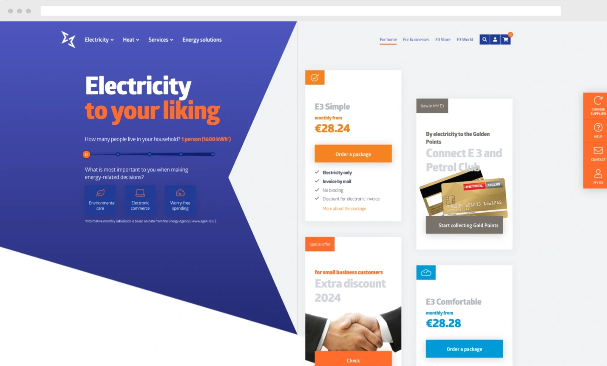
Our new business model is customer-centric and based on a personalized electricity offering tailored to our customers’ lifestyles. We paid special attention in designing our packages so that the advantages of each package are clear and easy to understand. The core electricity offering is topped with attractive consumer articles and various goodies at very competitive prices.
How does your new strategy reflect the user experience?
Modern consumers prefer self-service tools to manage their accounts. They want to be in charge, so it was our goal to go along with their requests. Now, they have all the relevant information in one place so they can decide what to buy. For example, they can calculate their credit score, upgrade or downgrade their current package and choose the installment rates that suit their personal finance plan. The self-service portal conflates with the website to form a unique, coherent user experience.

How does the new website affect your day-to-day editorial work?
The new website management is much more effective. Before the redesign, creating new promotions was always a strain. Now, we have much more maneuvering space to conceive new marketing initiatives while the system takes care of routine tasks.
Solution
User experience
A purpose-built user experience design draws on several key elements:
- Simplicity and convenience
- Transparent user communication
- Sales principles
E3’s business model is a complex one. Too much information and an overwhelming number of decisions could overload users and drive them off to explore other more simplified options.
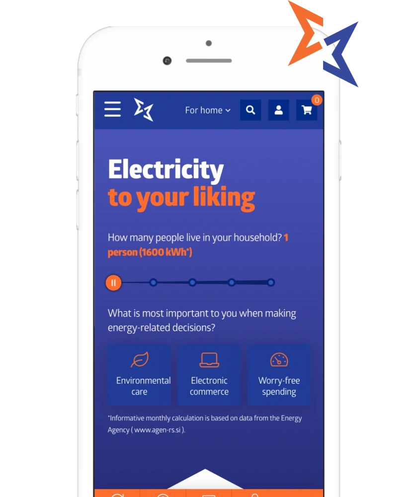
Ideally, user experience design should be guided by sales principles. By filtering offerings according to users’ individual preferences, we ensure the amount of information presented to the user is digestible and the offering is relevant to their interests. The package wizard provides advice during every step of the purchasing process to gently push users towards the buy button.
Technology
The solution we proposed to help E3 redefine their online presence is more of a self-service portal than a website. Nevertheless, it required all the components of an e-commerce solution: a catalog, user and order management, shopping cart, etc. We decided to build the site on the e-commerce framework Sylius, a perfect starting point for atypical shops like E3. Sylius’s modular structure provided us with much-needed flexibility and good control of information flows. The website is integrated with E3’s ERP, CRM, and order management systems. We were also able to incorporate their social channels, email system, Google Analytics and marketing automatization tools.
Do your users appear to struggle with finding the right products in your online store, too? Are potential customers visiting your site but not converting? We are eager to know more about your challenges.
Contact us today to learn how to improve your user experience and win more customers.

 5,0
5,0
