The client
Have you ever thought of heading for Azerbaijan for your next holiday? To be honest, me neither. In Europe, the country rarely comes to mind when travelers consider their next journey, even if they like to travel off the well-beaten paths. But is this disinterest just?
The country is full of contrasting beauties of stunning nature and futuristic architecture, or rich cultural heritage and vibrant city living of its capital, Baku. These contrasts are reflected in the main motto of the country’s tourism strategy, set out in the campaign “Take another look.”
With that said, Azerbaijan is already a fairly popular tourist destination in the region, in the Middle East, and Russia in particular. According to the World Travel and Tourism Council, it has one of the world's fastest-developing travel and tourism economy. However, it is struggling to attract more visitors from the West.
But this is about to change.

Challenge
A team of young marketing professionals and digital experts assembled in the recently established Azerbaijan Tourism Board (ATB) was determined to position the country higher on the global tourism scale. They conceived a digital strategy capable of confronting rival destinations, even the most prominent ones, on an equal footing.
A country’s brand new tourist website was a pivotal element of this strategy. ATB needed a website that will delight, inform, and persuade. They knew that “pretty is as pretty does” and that just an attractive web design won’t cut it. They wanted a best-in-class user experience for their visitors. Following the motto “Research and analytics should tell the story,” they gathered all relevant data, ascertain the buyer personas, and contrived the project requirements.
Now they needed a creative team to tell their story.
They knew the user experience teams capable of delivering a globally competitive experience are scarce. They needed a team with broad-based development expertise, capable of working with a multidisciplinary design, engineering, content, and research teams, advocating for exceptional customer experiences.
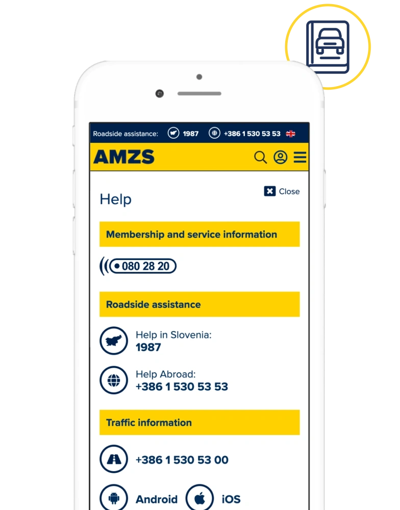
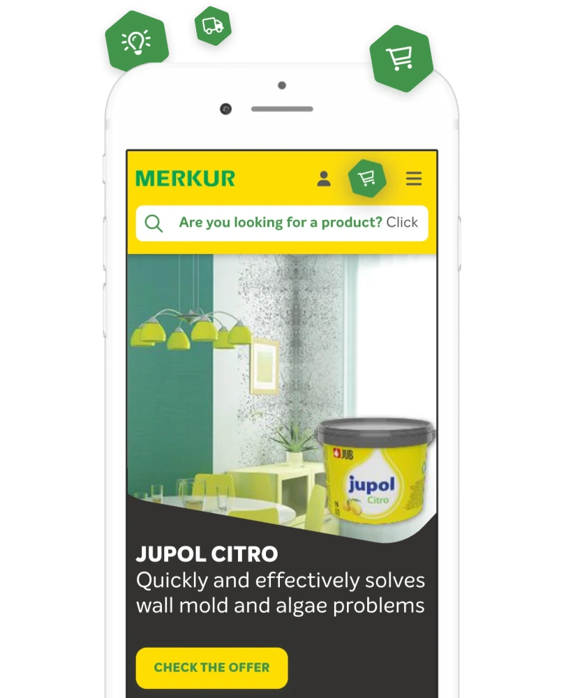
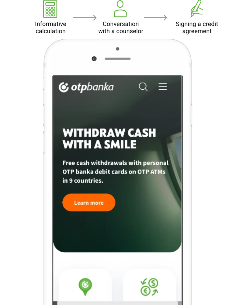
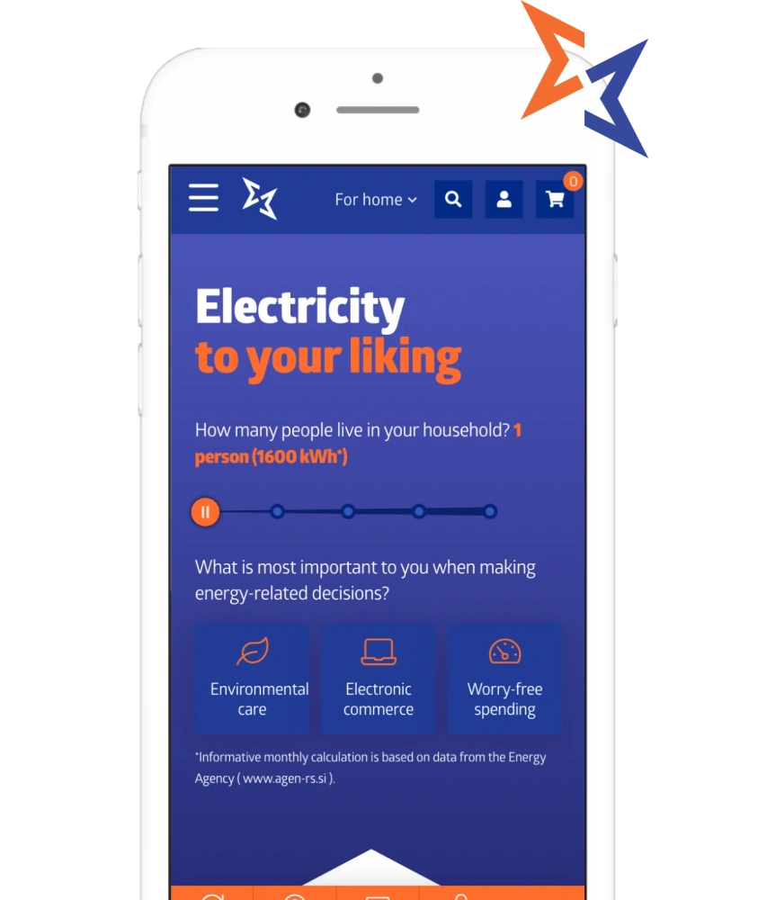
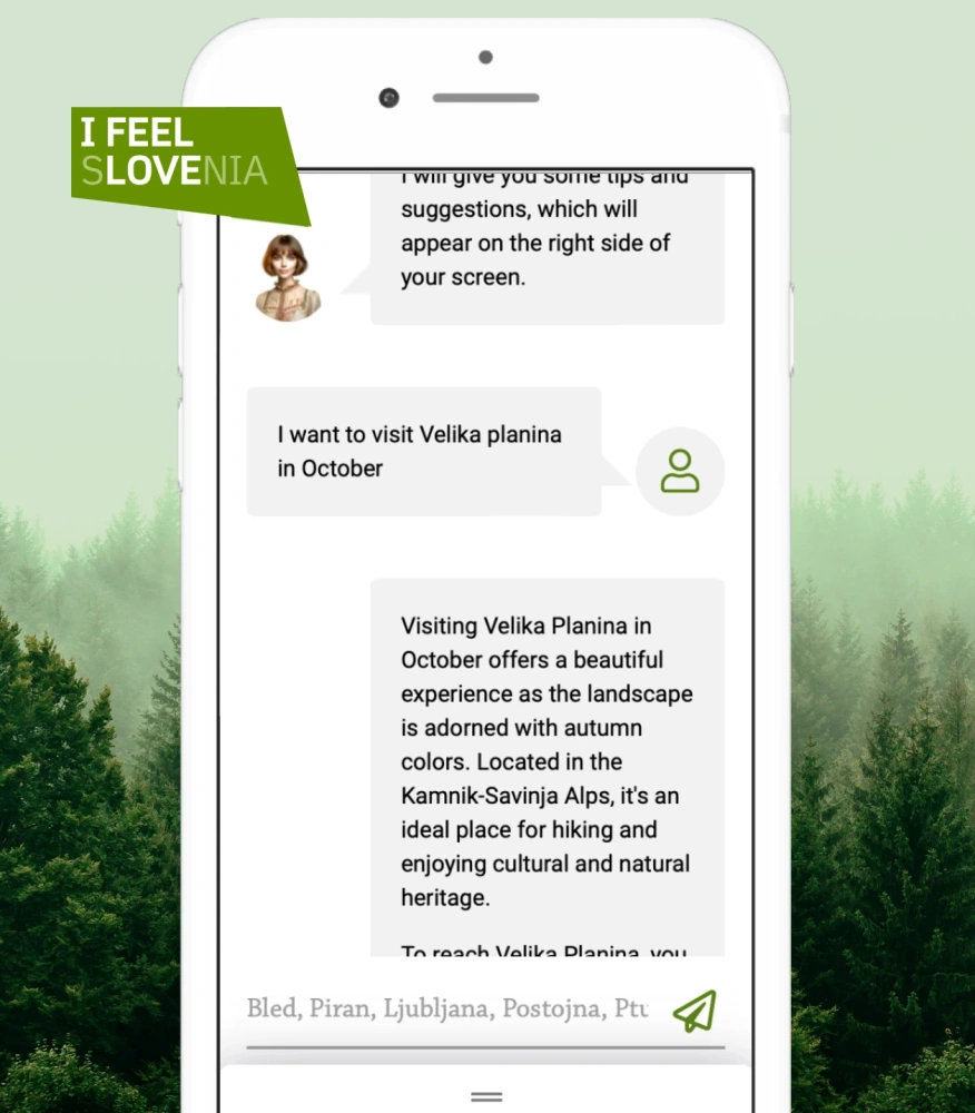
The ATB team set off to the web, looking for destination pages that would meet their criteria of a successful destination website, and even more importantly, they were after the teams that created them. Eventually, they shortlisted the most impressive sites. Among them, there was the destination website of Slovenia, www.slovenia.info, designed by Creatim.
Approach
The RFI invitation took Creatim by surprise. Honestly, we don’t get many RFIs from foreign state agencies. In the first exchanges of information with the client, we found out that there were many prominent user experience agencies - from Vienna to London - participating in the bidding. However, considering Creatim’s profile, it was nearly an ideal type of project. The team was excited to unleash its creativity. So despite the chances of winning the bid seemed rather slim, Creatim’s management decided to go for it.
One of the things we liked, in particular, was the fact that the client granted us access to many useful data, which we could bank on in our design proposal. We were able to substantiate the proposed user paths with real data and drive on the predefined user persona guidelines. This data brought in the dimension of down-to-earth reality: no wishful thinking, no overpromising. We were careful not to fuel unrealistic expectations, and maybe the ATB appreciated that honesty.
Overall, we did much more work than we usually do for a bidding proposal. Heck, we almost designed half of the solution!
But in the end, it was worth it. Creatim won the bid.
Solution
Driving upon our experience with the Slovenian site, we knew that coherent solution principles are of utmost importance for the project’s success. So two of our experts (a business analytic and a project manager) set off for Baku to discuss the project with the ATB team and frame the ultimate solution. In seven all-day workshops, they carved out basic solution principles and policies, such as
- The role of the website in the overall customer journey
- Key success indicators
- User experience principles
- Content strategy
- Social media strategy
- Promotions
In these workshops, the joint team revised the work that has been accomplished so far, evaluating various approaches and ideas, clarifying opened questions, and simultaneously reaching all related decisions. Eventually, everyone shared the same picture of what the outcome should look like. In the next phase, they elaborated:
- Personalization principles and primary user flows
- Trip-planning and recommendation tools
- Social media integrations
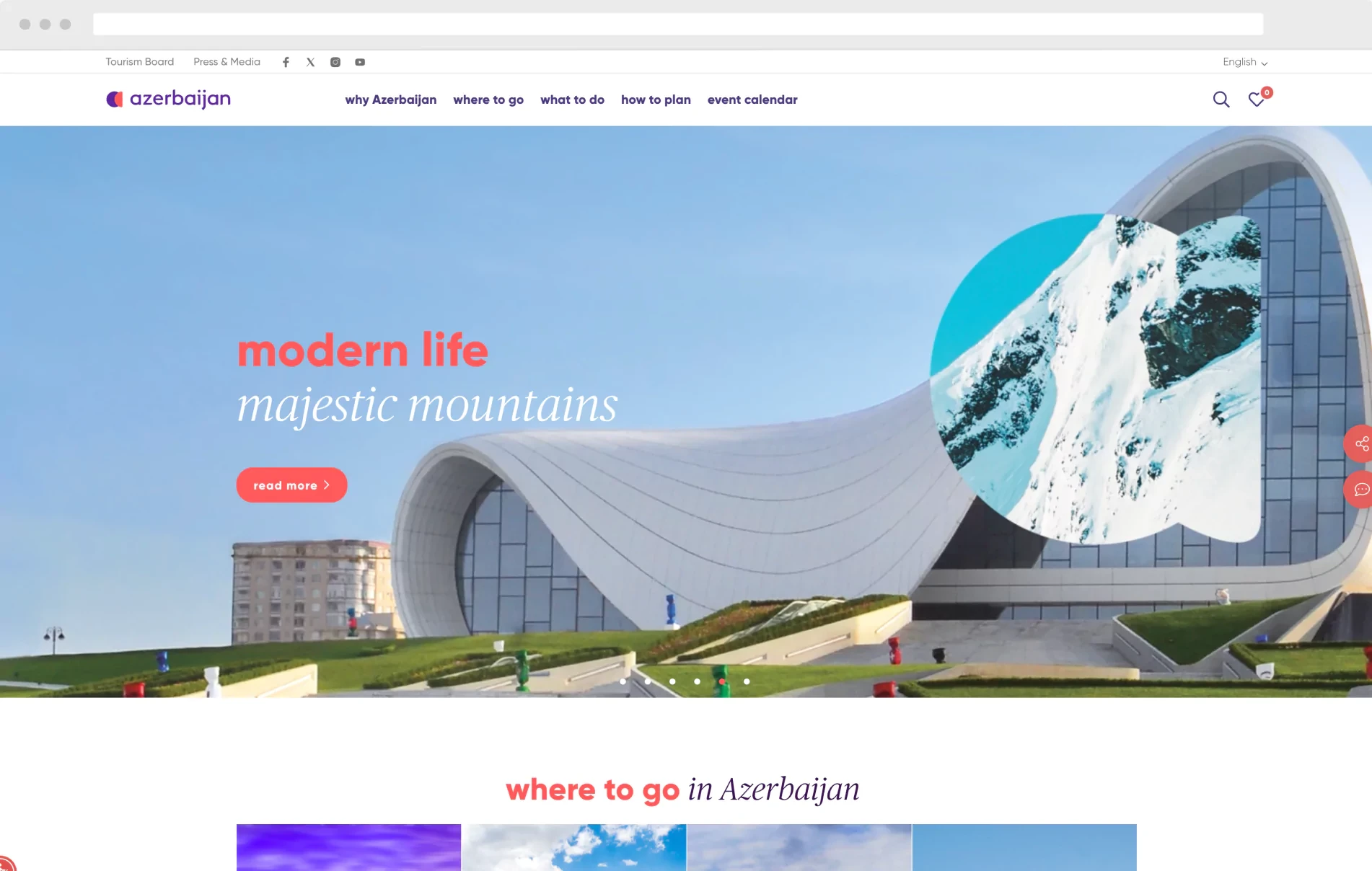
With clearly defined guidelines, designing a compelling user experience was not a big deal anymore. One month later, Creatim handed the client the final mockups and instructions for the developers. Six months later, the new azerbaijan.travel website welcomed its first visitors.
Creatim has helped us to bring our new azerbaijan.travel site to life. We recommend them for their strong UX and technology capabilities. Their solution design process has helped us reach a consensus on what the final product should look like.
Vusal Shahbazov, IT & Guest Experience Management Director
To wrap up
When the ATB team knocked on Creatim’s door, they knew what they were looking for; they needed someone to guide them through the solution design process. So they willingly followed Creatim’s advice, simultaneously reaching all necessary decisions along the way. In eight months from our first contact, the ATB was able to present its potential visitors with an excitingly fresh online flavor of their country.
On the other hand, eight months may seem like a lot of time. Still, with so many stakeholders involved, the page design could take much longer or worse - it could end up with vague recommendations for the developers, and consequently, unsatisfying outcomes.
The azerbaijan.travel site was launched in the odd times of the corona-crisis, so the statistical data on user visits is not relevant yet. But now, as the crisis in Europe slowly subsides, the traffic is starting to gain momentum as travelers are eager to explore the beauties of this exciting country.

Ready to take your digital product’s accessibility to the next level?
Lean back and let an expert do the work! Schedule a demo to discover how Creatim can assist you.
Contact us


